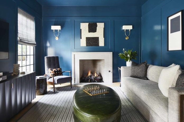
Bold is back. While minimalist, monochromatic spaces dominated interiors throughout the 2010s, 2026 is ushering in a return to spaces infused with personality and color. According to the 2026 Zillow Home Trend Report, “bold, color-drenched rooms… will define design in the new year,” with mentions of color drenching up 149% year over year. More homeowners are resonating with warm, expressive interiors filled with rich, thoughtfully chosen hues. Or as the Trend Report puts it: “Cookie-cutter design is fading as… buyers are embracing unique, personality-rich details that make a house feel like a home.” Looking to bring some of this joie de vivre into your own space? We spoke with interior designers to learn all about color drenching, why it’s poised to take over 2026, and how to try the trend without regret.
What Is Color Drenching?
“Color drenching is all about going all in on a single hue,” says Courtnay Tartt Elias, principal and creative director of Creative Tonic Design. The idea is to wrap every part of a room—walls, trim, ceiling, baseboards, even furniture—in “one cohesive color story,” she explains. “Instead of letting color play a supporting role, drenching makes it the star.” After years of pared-back palettes, homeowners are craving spaces that feel full of warmth, depth, and character, and color drenching delivers all three. “Homeowners want to tell their story rather than the story of a catalog,” Tartt Elias adds.
Photographer: Aimee Ryan for Molly Miller Interiors
Color Drenching vs. Accent Wall
“An accent wall is a moment; it’s meant to stand out from the rest of the space. Color drenching is a mood; it completely defines the space,” says Tartt Elias. While an accent wall relies on one surface to do the heavy lifting, color drenching brings every surface into play, creating what she deems “a more seamless and intentional look. It’s bold but also unfussy. Because the color is everywhere, it feels more like a mood than a focal point,” she notes.
Where to Use Color Drenching
Interested in dipping your toe (or should we say paintbrush) into this trend? Start small! says Tartt Elias. “A guest bath or reading nook—showing up 48% more often in Zillow listings—is the perfect place to experiment.” Lesley Myrick, founder of Lesley Myrick Interior Design, agrees: “Color drenching shines in smaller, more contained spaces like offices, bedrooms, and powder rooms.”
Myrick recently drenched a study in soft green-gray and says it “completely transformed the space. Suddenly, the wood tones, art, and lighting felt richer and more layered.” Color drenching, she adds, is an easy way to make a space feel curated without adding visual clutter, particularly in smaller rooms.
Photographer: Sarah Linden for Elizabeth Ryan Interiors
To-Do Before You Drench
Avoid a color-drenching disaster with this step-by-step guide.
Choose a Color
When it comes to picking a shade, start with one you naturally gravitate toward; a color that makes you feel good. Maybe it’s a soft olive green that helps you unwind, or a warm terracotta that reminds you of a beautiful sunset. The important part is to choose a color you’ll love seeing every day.
Still unsure which hue is for you? Myrick swears by deep, moody tones like olive, navy, and aubergine. For something softer, she suggests dusty greens, warm taupes, or blush pinks for a calm, serene vibe. Cathy Hobbs, founder of Cathy Hobbs Design Recipes, recommends using “fire colors” such as mustard or orange in rooms that don’t get much natural light to instantly warm them up.
Test Your Color
Before you envelop every surface in color, “paint a test section or even an accent wall and live with it for a few days,” says Lisbeth Parada, color marketing manager for Sherwin-Williams. The size of a room and its lighting dramatically affect how a color reads, so “notice how it changes throughout the day under both natural and artificial light—you might be surprised by how different it feels during the day versus at night,” she says.
Combine Finishes
Even though color drenching relies on a single shade, playing with different finishes keeps a room from falling flat. Myrick recommends using matte on the walls and a subtle sheen on trim, while Parada gravitates toward eggshell for walls and satin for trim. Mixing finishes adds subtle depth and dimension without disrupting the monochromatic look.
Add Touches of Texture
Here’s where the fun begins: bring in texture through decor and materials. Tartt Elias suggests bringing in patterns through upholstery and mixing in metallic accents and complementary colors with your fixtures and decor. Myrick likes to add texture through rugs and lighting, such as a woven accent rug or rattan sconces, to make the space feel cozy.


