You may or may not have heard of Furl, a British company that designs and makes high-end things to sit/lie on with storage in them – that’s sofa beds, storage beds and storage sofas.
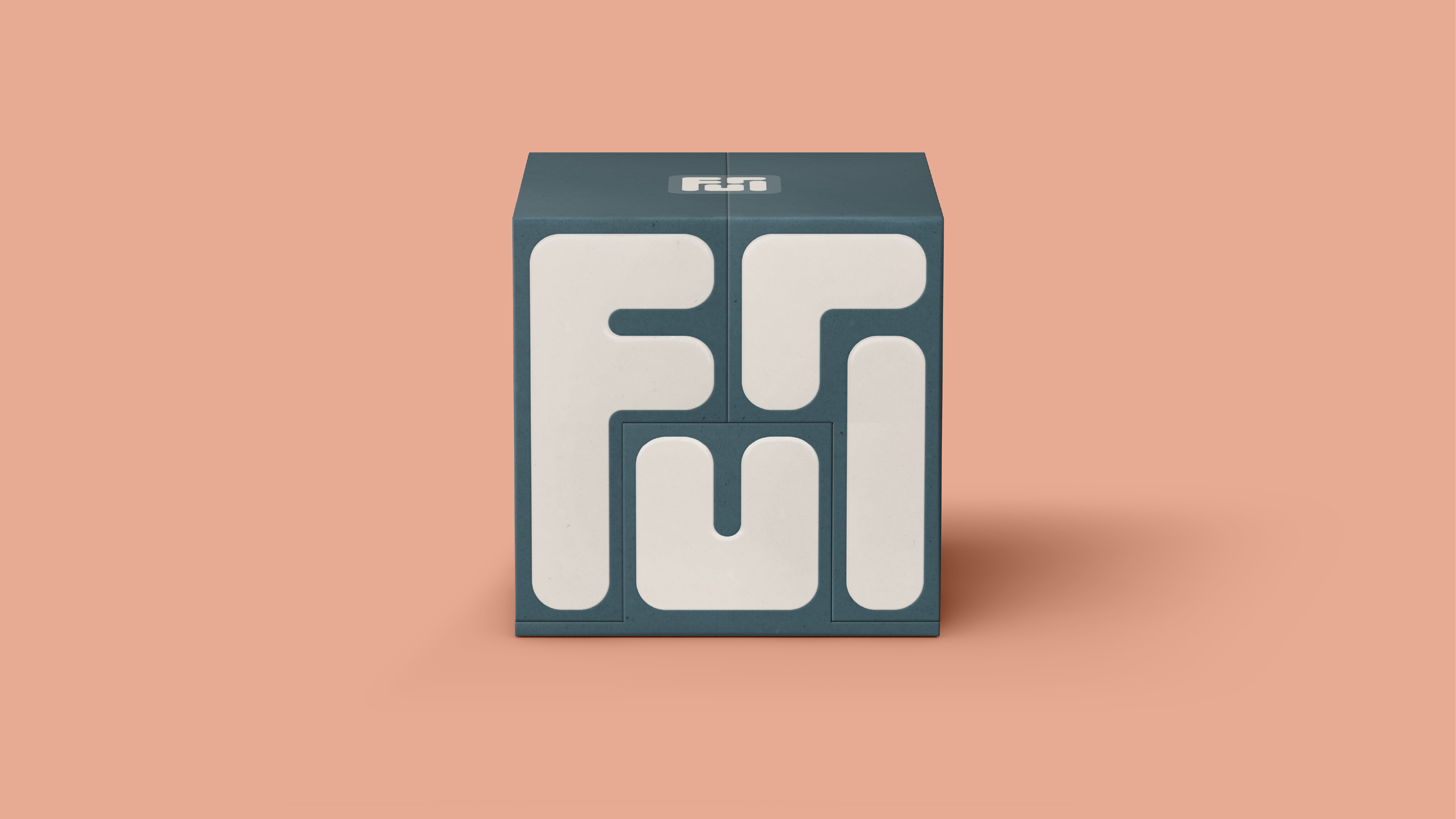
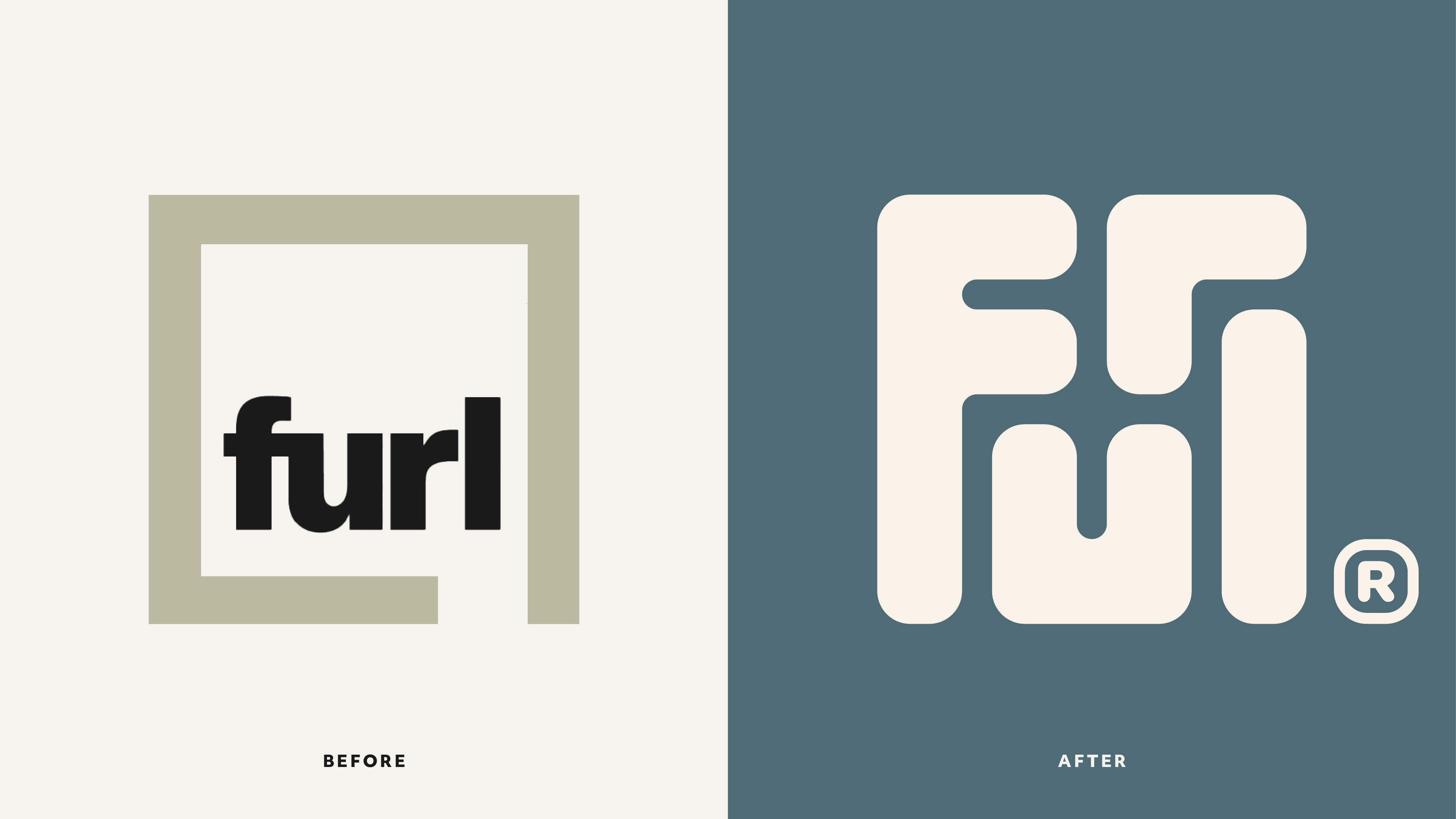
But you’ll be more likely to pay attention if you do come across them as Furl now have a revamped new look by Derek&Eric, complete with a clever logo that folds up as neatly as its sofa beds.

The new logo unfurls and furls together seamlessly, and is inspired by the transformational nature of Furl’s pieces.
It’s set within a classically refined palette, classic typography, soft patterns and serene yet sun kissed photography, and aims to evoke a feeling of effortless luxury and mindful clarity. I think it achieves this.
The reasoning behind this shift is that consumers are finding it harder and harder to justify buying luxury or high-end items. Furl recognised that they needed to appeal to feelings rather than just function.

The previous brand was all about engineering detail and technical benefits, while the new identity is all about feeling calm and considered.
“This wasn’t about chasing trends or changing who Furl are,” says Alex Stewart, creative director at Derek&Erik.
“It was about unlocking the emotional value already built into every piece they make. Helping people feel what their furniture has always delivered: more space, more clarity, and more ease.”
“We’ve always focused on craftsmanship and service, but the new identity gives us a clearer way to show people the real-life impact of that,” says David Norman, founder of Furl. “It’s not just about storage or engineering. It’s about creating a space that makes you feel more at home, and Derek&Eric completely got that.”
I think this is a really successful rebrand, and I just love the way the logo transforms. It’s got a hypnotic feel to it.
For more great rebrands, see the best rebrands of 2020s (so far).


