Every item on this page was hand-picked by a House Beautiful editor. We may earn commission on some of the items you choose to buy.
Dark Olive

Gray-Brown

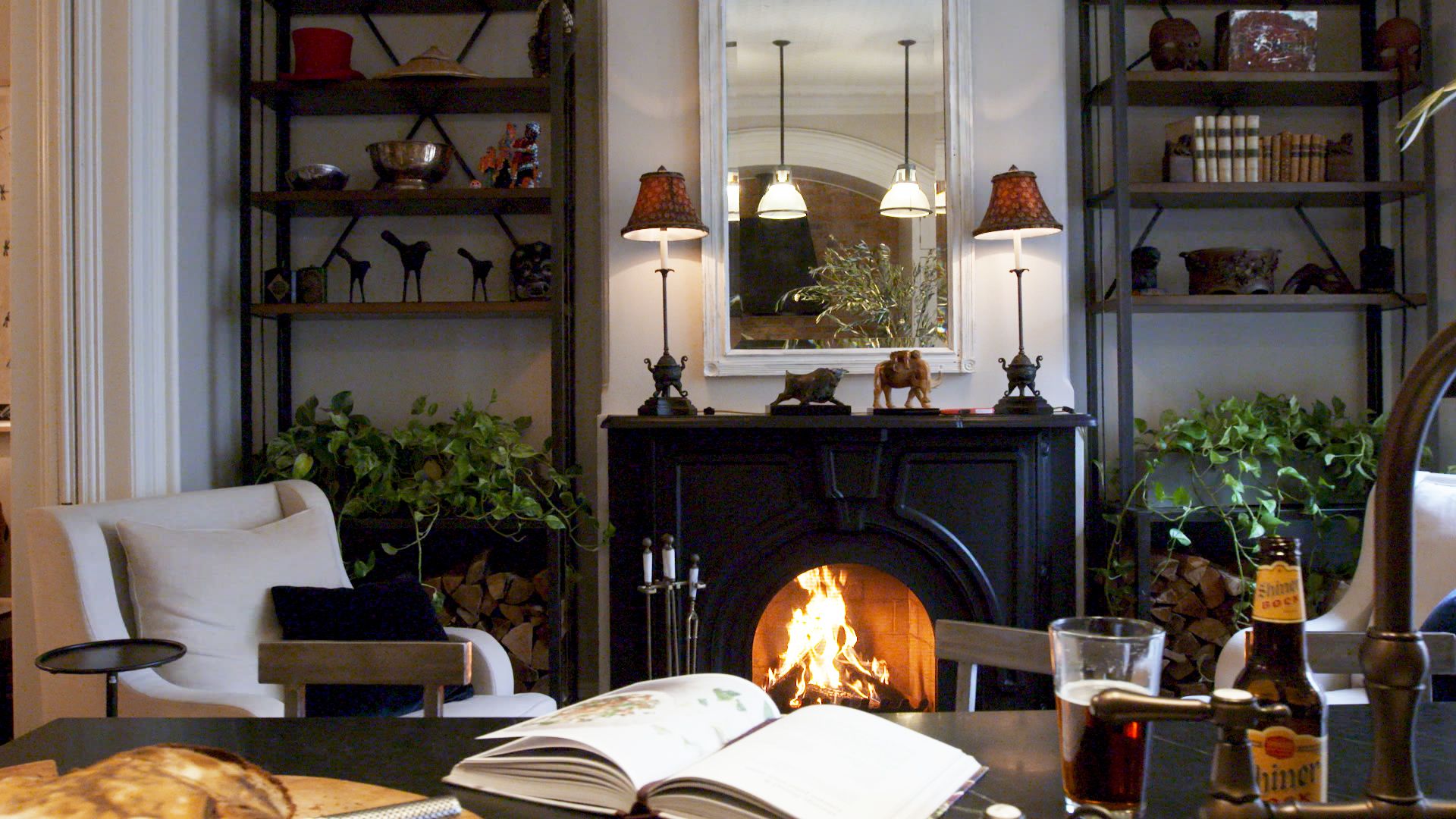
Designer Sarah Stacey needed the perfect paint color for this speakeasy living room in her clients’ home, and a rich gray-brown fit the bill. It’s a cozy spot, meant for taking breaks from dancing and connecting over drinks, and the cocooning hue makes it feel all the more intimate.
Advertisement – Continue Reading Below
Lime and Magenta

Saturated Mauve

Designer Ali Budd chose this plum color for the living room (Patchwork Plum by Sherwin-Williams) because it nicely ties back to the bubblegum pink range in the kitchen. Along with the marble fireplace and curved furniture, this paint color lends an intimate element to the space.
Advertisement – Continue Reading Below
Inky Blue

Kelly Green

The deep, Kelly green walls in designer Hannah Ozburn‘s living room almost serve as a neutral in the colorful space. If you love mixing colors and patterns in your home, choosing a deeper tone for your living room walls can help ensure the space doesn’t feel too busy.
Advertisement – Continue Reading Below
Slate Blue

When you’re selecting a living room paint color, remember that you don’t have to paint your walls if you don’t want to. Instead, let your ceiling have a moment, like designer Suzanne Kasler did in this cozy wood-paneled room. She chose a glossy slate blue (Providence Blue by Benjamin Moore) for the ceiling to differentiate this space from the rest of the house.
Steely Green

Designer Serena Dugan chose the serene hue Raindance by Benjamin Moore for her living room paint color. A chameleon-like gray-green color like this shade is supremely flexible and can come off colder or warmer, depending on the furniture and decor you finish the rest of the room with.
Advertisement – Continue Reading Below
Mossy Green

You can’t always judge a paint color by its swatch—just ask designer Amber Lewis. “If you looked at this on a paint swatch, you wouldn’t pick it. But when the entire room is that color, it’s really lovely,” she says of this mossy green tone. Sometimes, it’s better to take a risk and start painting in a color you might be on the fence about, because you may just fall in love with the outcome. For a similar look, try Elemental Green by Dunn-Edwards.
Cloudy Blue

Designer and homeowner Minnette Jackson wanted to make her long, narrow living room feel more cozy, so in addition to choosing plush furniture, she also went with a custom paint color by Pittsburgh Paints in a cloudy blue. It’s elevated and brings a calming feel to the room, encouraging any occupant to sit back and relax.
Advertisement – Continue Reading Below
Delicate Pink

In this colorful New York apartment, designer Samantha Stathis Lynch chose a soft pink living room paint color called Tailor Tack by Farrow & Ball, using it on other parts of the home as well. The client wanted to use the spring cherry blossoms in Central Park as inspiration for the interior. “There’s nothing more uplifting than seeing the first pops of vibrant green shoot up in the center of the gray city,” Stathis Lynch says.
Ochre

Yellow can often be too pale or too vibrant, but ochre is a welcome middle ground. A deep, rich hue with brown undertones, this yellow shade is enveloping and inviting. Here, designer Byron Risdon chose ochre to complement the room’s tonal soft furnishings for a cohesive look.
Advertisement – Continue Reading Below
Burgundy

This hue, while actually a red-toned deep purple, appears more like a mahogany brown when painted across all four walls and the ceiling. “We wanted to bring in jewel tones to create a dynamic space,” designer Marie Flanigan says of this Houston home’s lounge. The rest of the house is painted bright white, allowing this space to be a cozy escape.
Warm Orange

This room, designed by Sarah Vaile, may be covered in wood paneling, but the cozy hue inspires us to get the look with a fresh coat of paint. Orange can be intimidating, but when paired with its complementary hue, blue, the color leans more inviting than garish.
Advertisement – Continue Reading Below
Sage Green

The soothing hue is arguably best loved for its use in kitchens over the years (we can’t forget 2021’s wide-sweeping trend), but it makes an equally calming statement in a living room. Take inspiration from the 2024 House Beautiful Whole Home, and pair it with warm furnishings and soft textures for a completely cozy space.
Lilac Purple

Advertisement – Continue Reading Below
Sunshine Yellow

This drawing room, designed by Ben Pentreath, is painted in a vibrant egg-yolk yellow that offers a sunny ambiance during the day and transforms into a warm and inviting space by night. The unique choice of living room paint color provides a striking contrast to the traditional gray and often dreary English climate.
Bright Pink

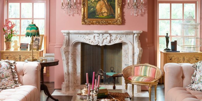
Much of the home redesign budget in this Texas home, executed by Hilary Colia and Jennifer Kostohryz of Fort Design Studio, went to trim and wallpaper, per the homeowner’s request. “Her love for color and pattern was a driver in every part of the design,” Kostohryz says. The great room is drenched in a bubblegum pink, which unexpectedly honors and highlights the home’s original architecture. Even the ceilings are painted to give the room a rosy glow.
Advertisement – Continue Reading Below
Deep Teal

Soft Turquoise

Watch Next

Advertisement – Continue Reading Below
Readers Also Read
Advertisement – Continue Reading Below
Advertisement – Continue Reading Below


